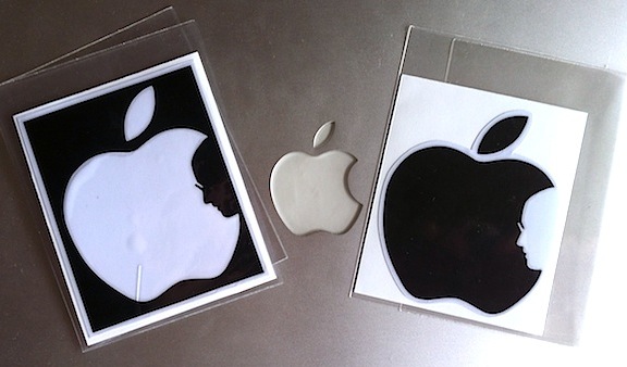
Family back from visiting Thailand earlier this week brought me back these images based on the iconic interpretation of the Apple logo to mark Steve Jobs’ passing.
I read the guy who developed the graphic Jonathan Mak Long‘s humble ‘I’m not sure if I’m first with this idea…’ message when he published it … and sure enough, there’s a little controversy. NBD.
– P


Really? firstly I don’t really care, but;
If people are believing the side of Jonathon because RAID71’s design does look as good and/or does not look enough like Steve is compelling evidence or that Google image dates confirm creation dates. they need to look at themselves.
Exactly. NBD (no big deal). – P
Here’s his original note ‘releasing’ the graphic…
http://jmak.tumblr.com/post/9377189056/thanks-steve-posting-designs-like-this-one
I am confused, he calls himself a liar? anyhow…
But interestingly he seems to apologize if someone beat him to the idea. which suggests a level of guilt and saw the idea before, even if just in passing.
Which is rather apt, after all thats whats Steve Jobs did great, saw a concept/idea sold more of the idea than the other guy and gets the credit.